This door knob was on a 1930's home in the Redwood Heights district of Oakland. This particular property sold needing repairs and TLC, I hope that the new owners keep this knob as it is a piece of art.
Second Look in Oakland
A few months ago I featured mid-century signs in Oakland and Berkeley and the sign below missed the cut. This cool 3-D mid-century sign is on MacArthur Boulevard in Oakland. (In the Laurel district)
Home Decorating 101 with Oakland Designer Laura Martin Bovard
Boy if I knew then what I know now... Being the shopaholic that I am, I have purchased furniture and home accessories with many different motives. The red sofas because I loved the lines and color, the oak mission desk furniture, because it was quality furniture and I was just starting out and didn't have an overall concept of what I wanted my house to be, the maple dining table with the veneer top, to the dozens of vases and art pieces that just called my name... Now I have a house full and wish I had an overall plan before I started.
As I looked at my home office space I realized that I need more storage and thought about asking my husband for an armoire for Christmas and then I thought, what would Laura do? Laura Martin Bovard is an Oakland based Designer who creates spaces that her clients love to live in. I have always steered away from Interior Designers as I thought I couldn't afford one, so I talked to Laura and asked her for some advise and realized that I had it all wrong.
Q: How do you advise your clients to start the decorating process?
A: One piece of advice I always offer my clients is to keep a folder with images from magazines or pictures of artwork you feel inspired by and collect them as you go. Whether you work with a decorator or just do it on your own it’s always good to have a place to refer back to when beginning the decorating or remodeling process. With so much exposure to what’s new and in fashion and it can be easy to get side tracked and end up feeling confused. Always good to have the general feeling tone established so that you can keep your focus on how you want your space to look. Having the design folder allows you to go back and see the direction you want to keep. That way you can say to yourself, “would this pillow that I love while I’m here in the store actually do what it needs to add to the feeling of warmth and comfort I want my room to have?” or “will this tile go with the counter material?”
Q: I have always thought I couldn't afford a decorator, what are your thoughts? A: Sometimes I hear that my clients don’t perceive that they can afford to work with a decorator but in fact in the end we can help them save money by coming up with a plan and by shopping smart. We have resources that most people don’t have access to and often get them at dealer pricing which allows us in many cases to re-sell them at below retail pricing. You can think of it this way…the money you save on making purchases through us goes to the design fees which is the time we spend coming up with and implementing a cohesive look that reflects who you are.
Q: What is it like to work with a decorator? A: When you work with a decorator it’s like having a coach tell you yes, that size will work or no, that finish won’t flow so you avoid making costly mistakes. Bringing a decorator in before making expensive decisions is very often where clients end of saving the most money. I can’t tell you how many kitchen and bath remodels I’ve seen go awry when people chose materials that simply don’t go together or don’t fit the style of the house. On the other hand a couple of hours with someone who has a good eye for design and experience can help you get through a remodel or a decorating without wasting time and money.
Q: Do you help clients with small projects, such as paint color consulting ? A: Yes, for less of a commitment but one that still nets good results we are able to come in for a few hours and help our clients freshen up their space without purchasing new items by styling with a designer’s eye by rearranging furniture, re-hanging art and basically “shopping” your own house to shift the energy.
Q: Can you tell me a few of your low cost tips? A: A few tricks of the trade that I’ve come to rely on for big impact are:
· Rearranging furniture and adding lamps or just new lamp shades and pillows or a throw over the back of the sofa
· I like to take the jackets off of hardback books and use them to style (the bindings provide great hits of color) books are a great way for people to learn more about you and I use them a lot for styling
· painting the backs of shelves a dark color to allow the objects and books on the shelves to pop off.
· I love to hang a textured or beautiful wall covering on just one wall which provides a focal point and another layer of beauty or just painting one anchor wall can make it feel like a whole new space. Good design is all about creating layers so when we see an opportunity to do so we jump on it.
The following pictures show a recently completed job in San Leandro, a fresh, soothing mid-century modern home. The construction remodel was done by Welte Construction, a local contractor in San Leandro. Laura said they are a super nice and professional firm.
Mid-Century Modern Details
My clients Jill and Cory just closed escrow on a 1953 mid-century ranch house in the Oakland Hills. When I first saw this house on the multiple listing service, I knew this house had potential. Homes built in the mid-century typically have steel reinforced foundations and gauging from the information provided, it looked to be a mainly cosmetic fixer. Additionally, many of the cool mid-century details were still intact. I could see past the orange paint and green carpets and I knew this middle-aged rancher was a diamond in the rough. Check out the Nutone doorbell chimes and the vintage mid-century fish tiles in the bathroom. Jill and Cory have agreed to let me share their renovation journey and I will bring you a progress report - photo journal soon.
Oh Julia!

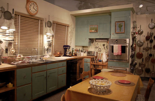
This past weekend I went to see Julie & Julia at the movie theater and I immediately came home and googled Julia Child. Why didn't I know more about her? I went to Culinary School for Pete's sake, I should have a library of her PBS television shows on my bookcase. My father watched a great deal of Saturday morning cooking, so I definitely remember her voice in the background of my life. The movie portrays Julia as a devoted wife who enjoys great food, great wine and butter. The photo above is Julia's Cambridge kitchen in 2001 after it was dismantled and put on display in the Smithsonian National Museum of American History. (Everything is from Julia's kitchen except the walls and floors.)
Why am I bringing up Julia Child, her movie and life on my real estate and style blog? Because I love her kitchen! Maybe it is because many great meals were prepared here, but also there is something homey about Kitchen-Aid mixers on the counters and a vast variety of pots and pans hanging on a peg-board. Often the kitchens that we drool over in magazines have sparse counters with bowls of lemons. The kitchens are fantastic, but they do not look lived in. I tried to find out when this kitchen was last remodeled, as I believe Julia hosted 3 different television series in this kitchen, but I had no luck. The green shaker style cabinetry is classic and warm, the large farm style table in the middle of the room is perfect for family gatherings or the ideal place to sit and chop. I never would have thought to hang framed artwork on my cabinet doors, but it all works. The wall oven is a bit big for the cabinet it holds, (making me believe that oven was a newer addition, but the photos of Julia Child's kitchen by Pedro E. Guerrero from 1962 look quite modern.) If any of you know more about the Julia and her kitchen remodels leave a comment!
(Click on the two links above to view cool links.)
Bold Style in Claremont Court, Berkeley
When I was a kid I always admired the homes in Claremont Court. I imagined that these homes had extra large crystal chandeliers and wonderful food simmering in the kitchen. As an adult, I admire the manicured yards, the classic architecture and the close walk to College Avenue and UC Berkeley. What I love about 2729 Belrose Avenue in Claremont Court is the style that the owners boast. Check out the bold colors, the eclectic decor , so unexpected and wonderful! 2729 Belrose Avenue is currently listed with Ruth Frassetto with GrubbCo.
Circa 1900 Home Goes Mod in Oakland
Yesterday after I held open 5740 Ayala Street in lower Rockridge, (a pristine craftsman home with impeccable natural wood trim, wainscoting and built-ins. and vintage details.) I headed over to view 492 58th Street, (in Oakland). The buzz around town is that this born in 1900 home in lower Rockridge (a bungalow turned mod pod) was the house to see. This home is a design buffs dream! The bathroom in the main house has hand applied stucco walls that are silky smooth and designed to withstand water and the steamy conditions of a hot shower. Every nook and cranny is engineered to efficiently store the items in your life. The washer and dryer are hidden in a wall of white cabinets and the there is big chunks of natural wood built-in benches and bookcases. Of course the yummy home furnishings and lush yet simple gardens enhanced my viewing experience. 492 58th Street in Oakland has a two bedroom, one bathroom main house and a one bedroom, one bathroom guest house. (Listed with Ron Kriss of Lawton and Associates for $750,000.) This pad is available now, but offers are due this Thursday. Click here to view this Oakland home on Dwell.com. (If you love high style and mid-century modern homes this is a must see.)


