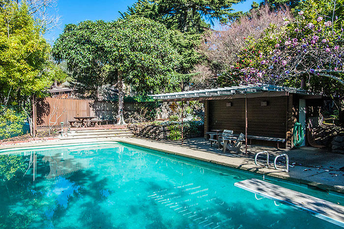
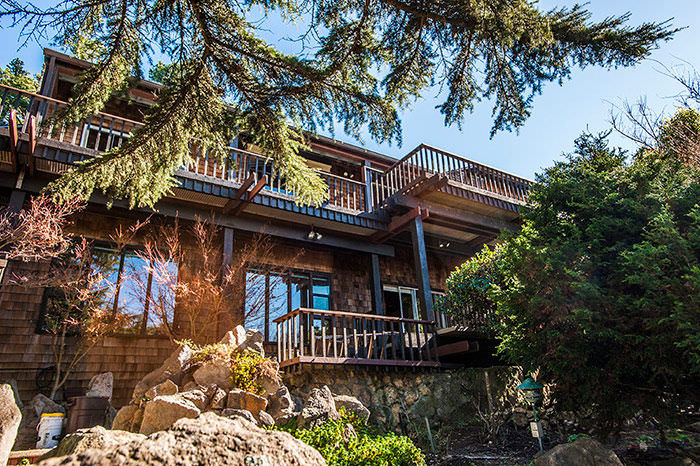
Outdoor Space

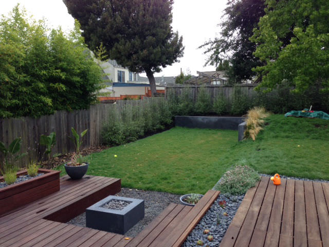
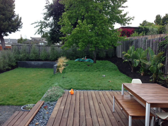
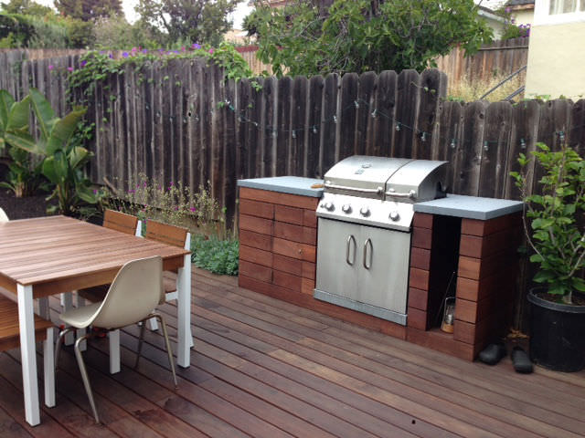
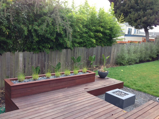
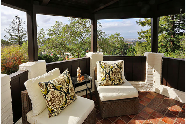
California has such great weather, practically year-round.  An outdoor space can be a magical addition that many buyers will consider a big plus!  See the before and after photos below of a property I sold a couple years ago and the transformation of their outdoor space. BY_Before

BEFORE

BY_3

AFTER

BY_2

BY_1

BY_5

BY_4

Yummy Oakland Real Estate

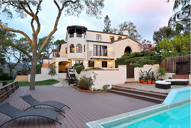
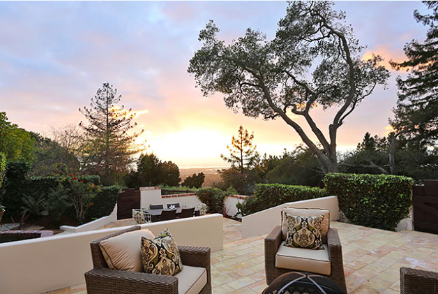
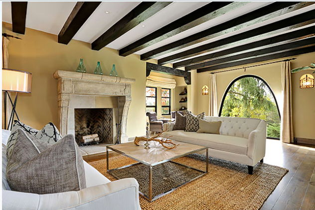
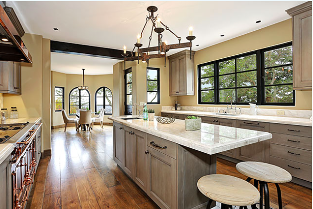
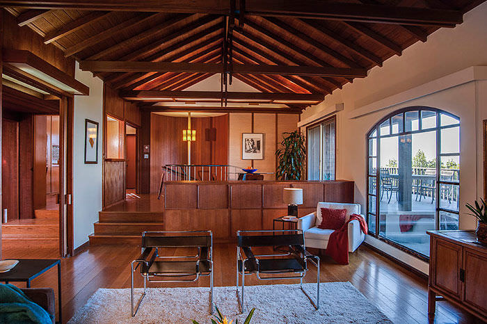
Many who are familiar with the Oakmore Highlands area of Oakland have often admired this property.  Four parcels were combined to make this a prime lot with scrumptious views.  With level garden areas, a pool, an observation deck and mature trees, this 1936 Mediterranean home is spectacular!  Extensive remodeling was performed to provide modern amenities while keeping with the vintage aesthetic.  4 bedrooms, 5.5 bathrooms, 5,641 sq ft.  Currently listed at $3,290,000.  (Source: Carol Brown's listing from Grubb Co.).
Screen Shot 2014-11-18 at 8.12.13 AM
Screen Shot 2014-11-18 at 8.12.01 AM
Screen Shot 2014-11-18 at 8.10.38 AM
Screen Shot 2014-11-18 at 8.11.07 AM
Screen Shot 2014-11-18 at 8.11.25 AM
Screen Shot 2014-11-18 at 8.11.51 AM

Marketing and the Inspiration Behind It!

I am listening to Pandora loving the bass in my headphones while I am working on my newest listing.  I get motivation from some of the most random things.  If something catches my eye, I like to see how I can I incorporate it into my art.  Yep, I said it, art.  Yes, I am a licensed, full-time and top producing Realtor, but I take every property that I list and I look at it as a unique specimen and try to showcase it as if it were something fit for the Smithsonian. Yesterday's inspiration started by looking at an online ad for Kaiser that had shiny gold font.  I texted my graphic artist, Jenn, and asked her if we could use a gold font that would look metallic in print.  She said that could be difficult for the materials that I needed.  Then magically, I was scrolling down my Facebook feed and saw this “Thank You Fans” post from the Oakland Athletics and I screenshot it.  I emailed Jenn and said, this is the inspiration!  I requested that the word Rockridge be in bold with an image behind it.

Thank You Fans
Thank You Fans

My girl Jenn did some mind reading and I gave input and voila!...

that Rockridge life
that Rockridge life

For the image behind "Rockridge" Jenn took a screenshot from the Red Oak Rockridge video:

With all of the all of the template marketing and over used adjectives out there, what will make your home stand out? 

Truly, you never know what draws someone in.

Preparing a property for sale and what is important...

It’s funny how people meet; Josh and Traci stumbled upon my blog years ago and hired me to be their buyer's agent. I am honored that we retained a friendly and working relationship as I am now their agent on the listing side. Six years ago I saw 12 Eastwood Court on Broker's Tour and I immediately called Traci and Josh.  This home was quite unusual as it had a very usable, sunny backyard.  The home felt very happy and I wanted to get their take on it.  That night we went for a visit, and after comparing and contrasting this property to other homes in Montclair and Lincoln Heights, they decided to make an offer and succeeded with multiple offers on the table.  For Traci, it was all about the true chef's kitchen.

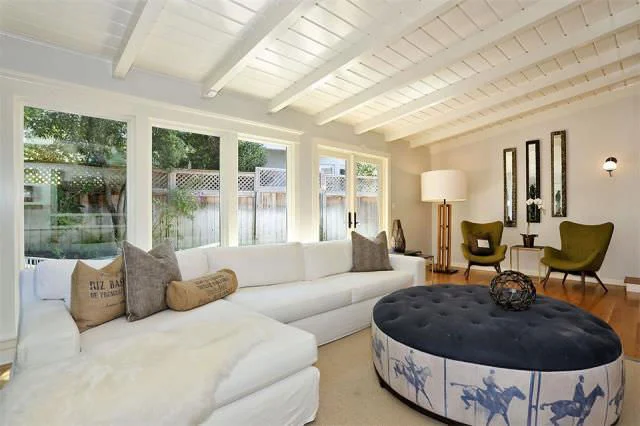
Many improvements were made over the last six years of their ownership, and as they recently prepared for the sale their home the one thing that was a bit overwhelming and dated was the lava rock fireplace; see the before and after photos below…
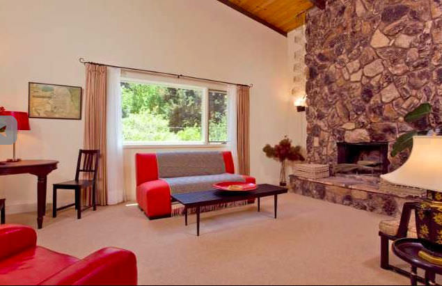
Eastwood living room before

BEFORE (Source: East Bay Regional Data)

12 Eastwood 27

 AFTER

With the average age of today's homebuyers being 38, it was important to style the home with a breath of fresh air and I am thrilled how this property shows.  This is a home that one can simply move right into and be happy!

I was very happy to partner with professionals that helped us take this property to the next level; Visual Jill (www.VisualJill.com) acclaimed local designers, and Peter Lyons, professional photographer.

Open this Sunday, September 21, from 2pm-4pm.   Please visit www.12Eastwood.com for more details and photos.
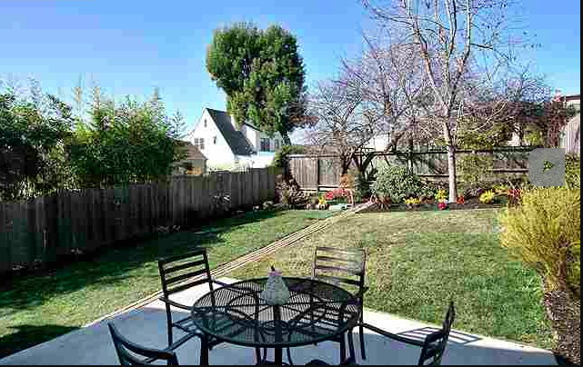
North Oceanview Berkeley - Business is Booming!

 The map above is interactive. If you do not see the markers, move the map around.

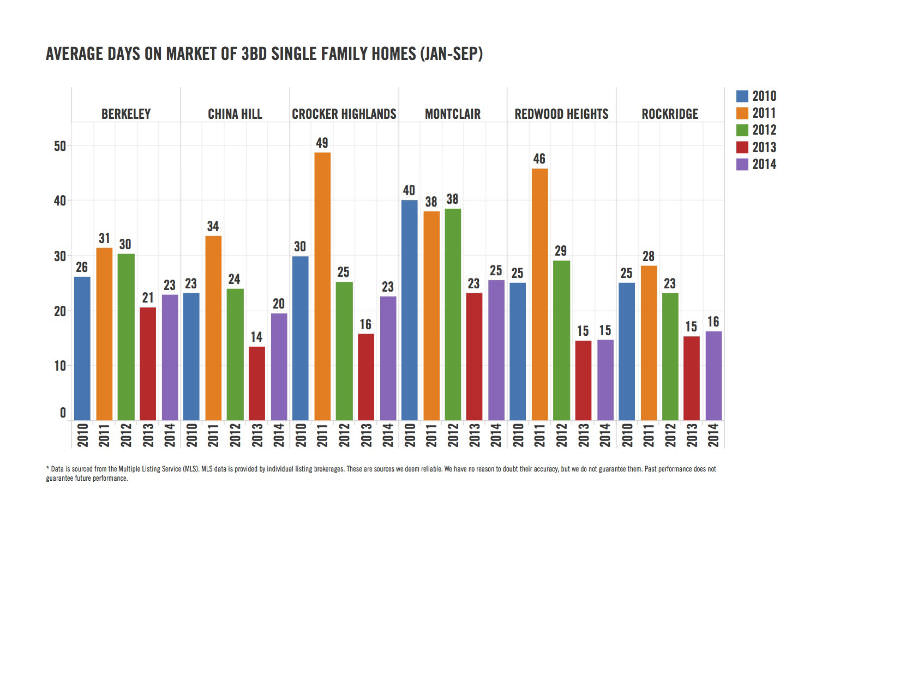
Last year I had the opportunity to sell a house in the north Ocean View neighborhood of Berkeley, 1468 10th Street. My clients were looking for a home that needed some love and had a big backyard.  We knew there were rumors of a Whole Foods coming to Gilman Street in the fall of 2014 and that Stella Nonnajust opened up around the corner, but I am excited to see more fun spots trickle in. Westbrae Biergarten, Philz Coffeeand Doughnut Dolly are just 3 of the new spots to open their doors. There is also great access to 4th St and the Bart.  Berkeley real estate has always been in high demand and I would not say any neighborhood is a bargain, however north Ocean View is a place that be considered and seen. Check out the map and press below!  

Press:

Buying a piece of history

1335 Delaware
1335 Delaware

A few weeks ago I helped my clients close escrow on a home that had been in the same family for the past 58 years.  After searching for move-in ready homes, my “beat down by the market” clients decided to utilize their resources, (the wife is an architect and the brother is a contractor). So they purchased a fixer upper home in a prime Berkeley neighborhood.  There will not be the immediate gratification of being able to move in and hang the television and art, and they may not get to restore everything at once , but they are making an immediate sacrifice to get into a great neighborhood and ultimately own a home that will be tailored for them.

I will help them after close of escrow and will stay in touch to see the progress, but thus far the process has been serendipitous.  These folks finally landed their Berkeley fixer after a very lengthy search - 2 years total with me being their 3rd Realtor. I was afraid this home would go to a buyer with an all cash, contingent-free offer. After consulting with their lender, we both felt that this was not a situation where we should waive all contingencies (feel free to contact me about contingencies and the various risk associated with writing offers).  After much deliberation, a decision was made to not submit an offer.  The offer date was on a Wednesday, so Thursday morning I called the listing agent to find out any inside scoop, so I could debrief my clients.  Much to my surprise, I was told that although there were cash offers, the seller was in the middle of negotiating multiple counter offers with 2 buyers that had contingencies in place and needed loans to fund the purchase.  I felt horrible that my clients may have lost out on an opportunity, so I immediately called them and explained the situation. Within 2 hours, I had submitted an offer on their behalf and by the end of the day theirs was the winner!

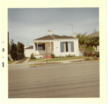
Above is a photograph that the sellers provided to their listing agent from 1959.  It is precious to see the first transformation, as this photo was taken before a second floor addition was made. I look forward to providing photos of the next phase of construction!

Bathroom Simple

Because of my bathroom remodel gone wrong  in 1999, I am a big advocate for do it right the first time.  When I purchased my home the entire place was in need of major repair, this was a major fixer. It needed 35 foundation piers, a French drain system, new roof, bathrooms, kitchen, paint, hardwood floor refinishing and that does not touch the landscaping, fencing and lighting.  At the time of the purchase I was completely overwhelmed with a 2 ½  year old and an 8 month old.  I picked out tiles and fixtures based upon cost and the desire to just have a clean space.  Of course I immediately hated the room when it was complete and despised when people had to use the bathroom, frankly I was embarrassed.  I am suppose to have great taste, what happened?!  Last year my husband and I decided to gut the space and start over.  We have a very different aesthetic, and to add to the complexity, I wanted to avoid anything Made in China. We designed it together and agreed on everything pictured.  Our home was built in 1951 and I wanted a modern, simple look that would blend with the home. At some point, I may add art, but I would rather have flowers, art and accessories add color.  I wanted a neutral space that I would not get tired of.