Styling, It's Not Just For Celebrities

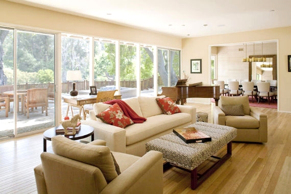
Every house has a different vibe, style, and architecture. When prepping a property for sale, its individuality should be taken into consideration. Not every home should have a mass produced feel with the same ol’ furniture and marketing. Even though it is a seller’s market there are properties that are not selling and some that are selling short of their potential; therefore, it is important to highlight characteristics and do the proper preparation to stand out from the rest. It is all about collaboration. I work with four different stagers and pair the stager’s style to that of my client’s property. Often it is the little touches that make the difference and set one listing apart from another. I attend Designer Showcase Homes to educate myself on what buyers want and to give expert insight.

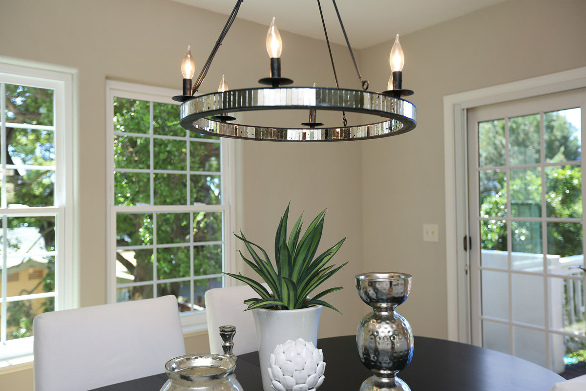
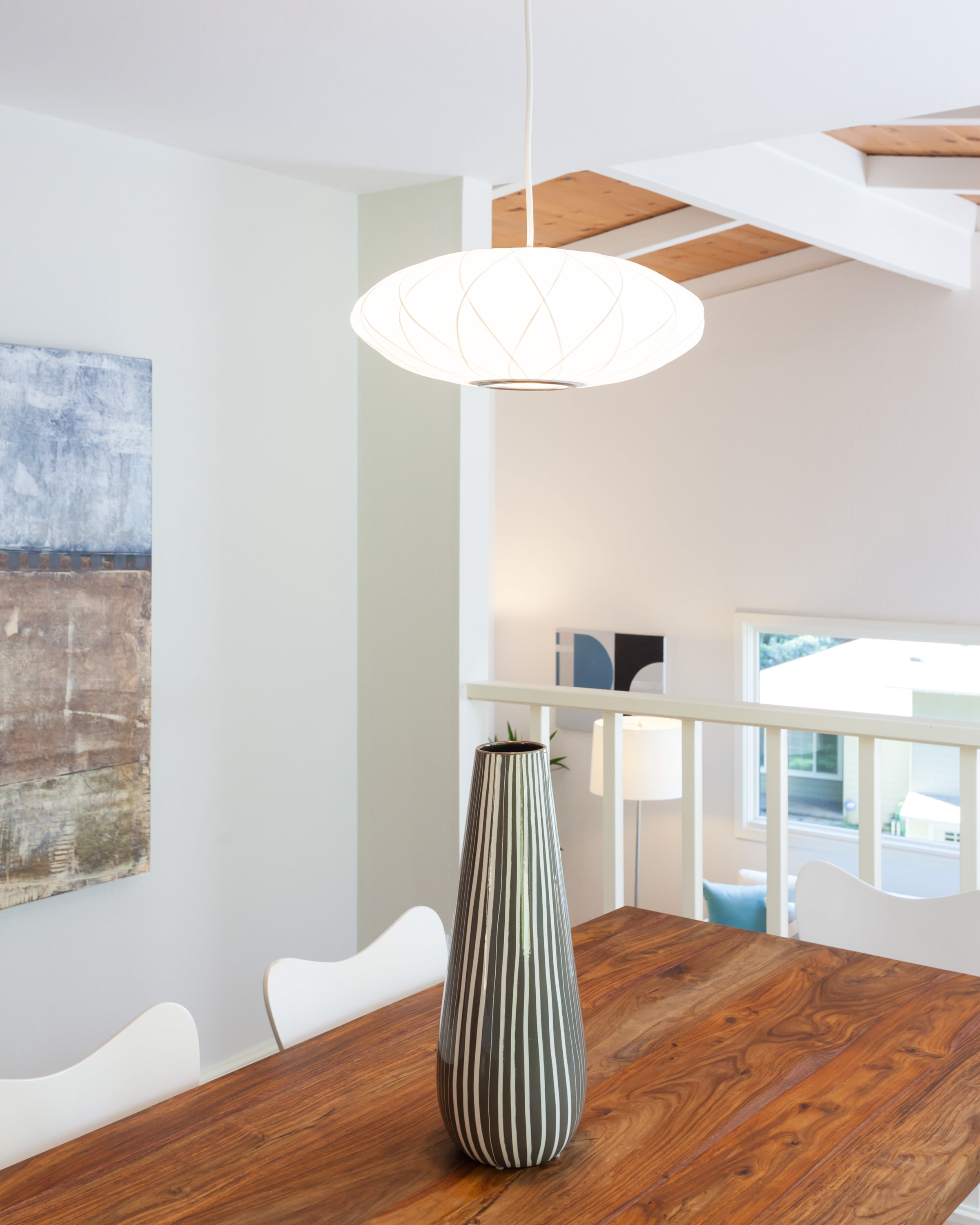
Light fixtures and colors are similar to belts and shoes; they have to go with the outfit.  You want your property to look good, right?  Not every house is already adorned with a gorgeous vintage dining room light fixture but adding one can be the key accessory in giving off just the right vibe to prospective buyers when they preview the home. The wrong styling, or repetitive styling, can leave money on the table. When the market shifts, how will your house stand apart?

87

12 Eastwood 19 large


Bathroom Simple

Because of my bathroom remodel gone wrong  in 1999, I am a big advocate for do it right the first time.  When I purchased my home the entire place was in need of major repair, this was a major fixer. It needed 35 foundation piers, a French drain system, new roof, bathrooms, kitchen, paint, hardwood floor refinishing and that does not touch the landscaping, fencing and lighting.  At the time of the purchase I was completely overwhelmed with a 2 ½  year old and an 8 month old.  I picked out tiles and fixtures based upon cost and the desire to just have a clean space.  Of course I immediately hated the room when it was complete and despised when people had to use the bathroom, frankly I was embarrassed.  I am suppose to have great taste, what happened?!  Last year my husband and I decided to gut the space and start over.  We have a very different aesthetic, and to add to the complexity, I wanted to avoid anything Made in China. We designed it together and agreed on everything pictured.  Our home was built in 1951 and I wanted a modern, simple look that would blend with the home. At some point, I may add art, but I would rather have flowers, art and accessories add color.  I wanted a neutral space that I would not get tired of.

Sneak Peek of 2013 Rockridge Kitchen Tour!

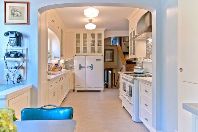
This past January, I dropped my daughter, Nia off at her friend's home for a sleepover and was totally inspired by this reinvented mid-century modernist kitchen.  The entire project was inspired by the 1956 Kelvinator side-x-side 'Foodarama' (literally it's name) Fridge.  Later I came to find out that this is one of the kitchens that will be featured in the 2013 Rockridge Kitchen Tour. Owners Diana and Craig used Architect was Struther Dias in San leandro:  www.strutherdias.com for the project.  

Here is a shot of fridge that was the beginning of it all.

A vintage ad of the Foodarama


They kept the original overall layout of the kitchen


All the appliances are period as are all light fixtures, telephones, tea pots,  drawer pulls and kitchenette(chair/table)


Field Trip for Inspiration

The other day I took a few hours off to service my computer at the Apple Store on 4th Street in Berkeley.  I always enjoy strolling down 4th Street so after my computer was serviced, I meandered down the street. The Gardener is always a place for inspiration.  The scent and the styling  here always makes me salivate.  Here are a few things to inspire:

The Gardener
The Gardener
persimmons
persimmons
succulents
succulents

Yasai Produce Market on College Ave at 63rd across from Cole Coffee has wonderful affordable produce for sale such as gourds and persimmons that can be styled into your home instead of fresh flowers.

gourds
gourds

If Your Walls Could Talk

I absolutely love what Joyce did during her kitchen remodel.  After renovating the kitchen and restoring the walls, she decided to create a "picture" of the history of  her 1910 home. In the photo below you can see various wallpapers and plaster layered under the paint. A nice rectangle was evenly measured to create a custom work of art.  Genius!

history of a home
history of a home

Before and After in Oakland

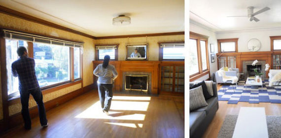
Every buyer has a wish list as they venture out and start their house hunt.  My Crocker Highland buyers wanted a home in original condition.  They wanted to embrace the vintage details of  a 1920's or 1930's property and enhance it to blend with their modern edge.

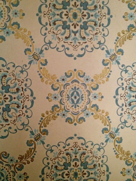
All of the original gum wood was preserved.  The hardwood floors were refinished with a water based matte finish to open up the space.  The wall paper was removed and the plastered walls were hand restored.

Oakland Kitchen Renovation

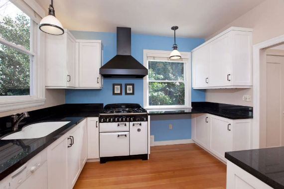
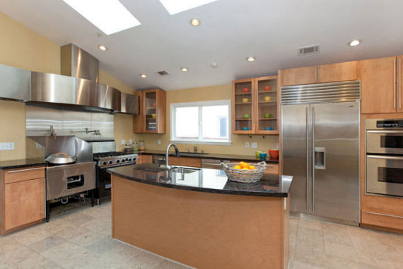
Earlier this year, I listed and sold, 3915 Laguna Avenue in the Dimond district of Oakland.  (www.TheLagunaCottage.com) This house was/is such a special house!  It sold with seven offers earlier this Spring, much in part to the gorgeous kitchen.  Richard and Christina, the former owners, hiredlocal architect Angela Klein to help with the lay-out.  They then hired, Oakland contractor, Rebecca of Paragon Kitchen and Bath Remodel.  After all of the love, thought and heart poured into this renovation, I was curious to see what this room looked like before the transformation. I am always intrigued by a home's history, so I had to find out more.  Unfortunately we could not find any before pictures, so I contacted the Realtors who listed the house when Christina and Richard purchased the house some years back...and I was in luck!  They still had a few snapshots of the kitchen.  Look at the metamorphosis below:

Laguna Kitchen BEFORE & AFTER

Laguna Kitchen BEFORE & AFTER

BEFORE

BEFORE

AFTER

AFTER

Oh Julia!

JuliasKitchen

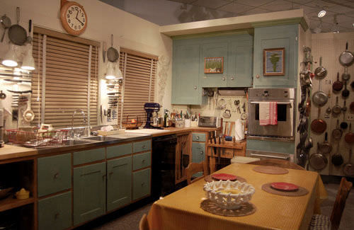
This past weekend I went to see Julie & Julia at the movie theater and I immediately came home and googled Julia Child.  Why didn't I know more about her?  I went to Culinary School for Pete's sake, I should have a library of her PBS television shows on my bookcase.  My father watched a great deal of Saturday morning cooking, so I definitely remember her voice in the background of my life.  The movie portrays Julia as a devoted wife who enjoys great food, great wine and butter.  The photo above is Julia's Cambridge kitchen in 2001 after it was dismantled and put on display in the Smithsonian National Museum of American History. (Everything is from Julia's kitchen except the walls and floors.)

Why am I bringing up Julia Child, her movie and life on my real estate and style blog?  Because I  love her kitchen!  Maybe it is because many great meals were prepared here, but also there is something homey about Kitchen-Aid mixers on the counters and a vast variety of pots and pans hanging on a peg-board.  Often the kitchens that we drool over in magazines have sparse counters with bowls of lemons.  The kitchens are fantastic, but they do not look lived in.  I tried to find out when this kitchen was last remodeled, as I believe Julia hosted 3 different television series in this kitchen, but I had no luck.  The green shaker style cabinetry is classic and warm, the large farm style table in the middle of the room is perfect for family gatherings or the ideal place to sit and chop.  I never would have thought to hang framed artwork on my cabinet doors, but it all works.  The wall oven is a bit big for the cabinet it holds, (making me believe that oven was a newer addition, but the photos of Julia Child's kitchen by Pedro E. Guerrero from 1962 look quite modern.)   If  any of you know more about the Julia and her kitchen remodels leave a comment!

(Click on the two links above to view cool links.)